

sanal mağaza
Randevu
etkinlikler
Pop-up

Plan Compare: Comparison Table
Sunan:
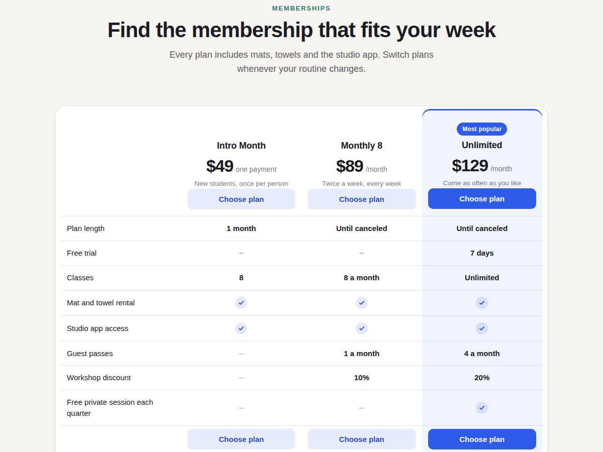
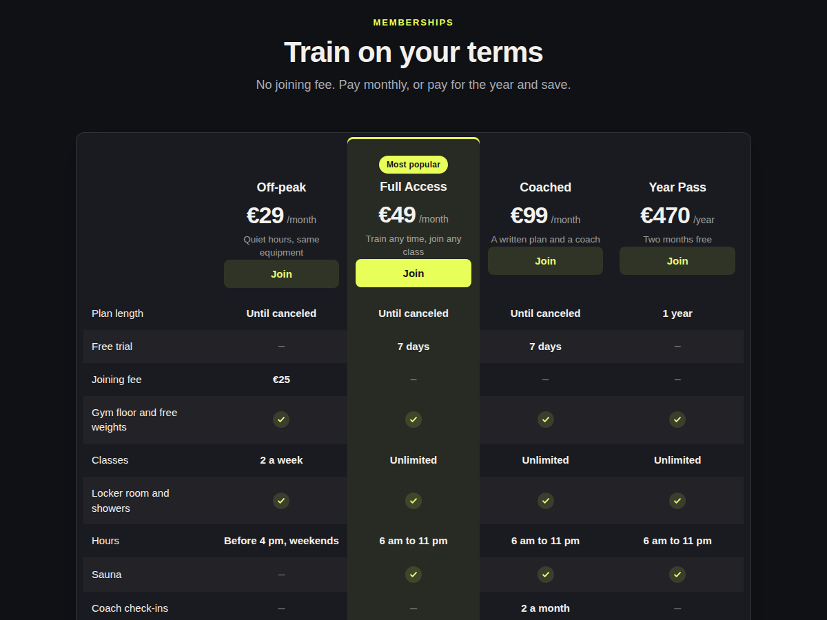
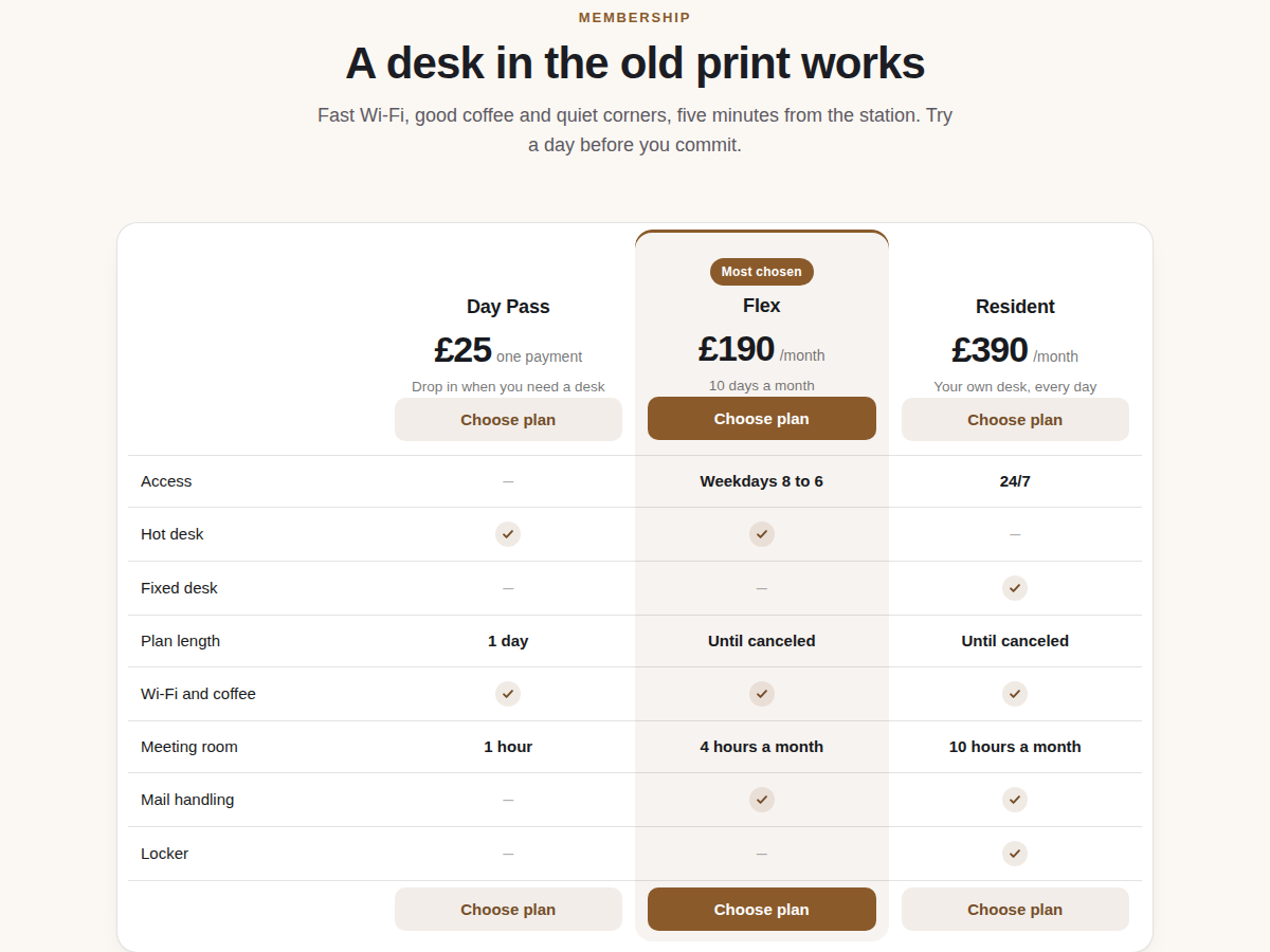
Plan comparison table built from your plans
Henüz değerlendirme yok
Ücretsiz paket mevcut

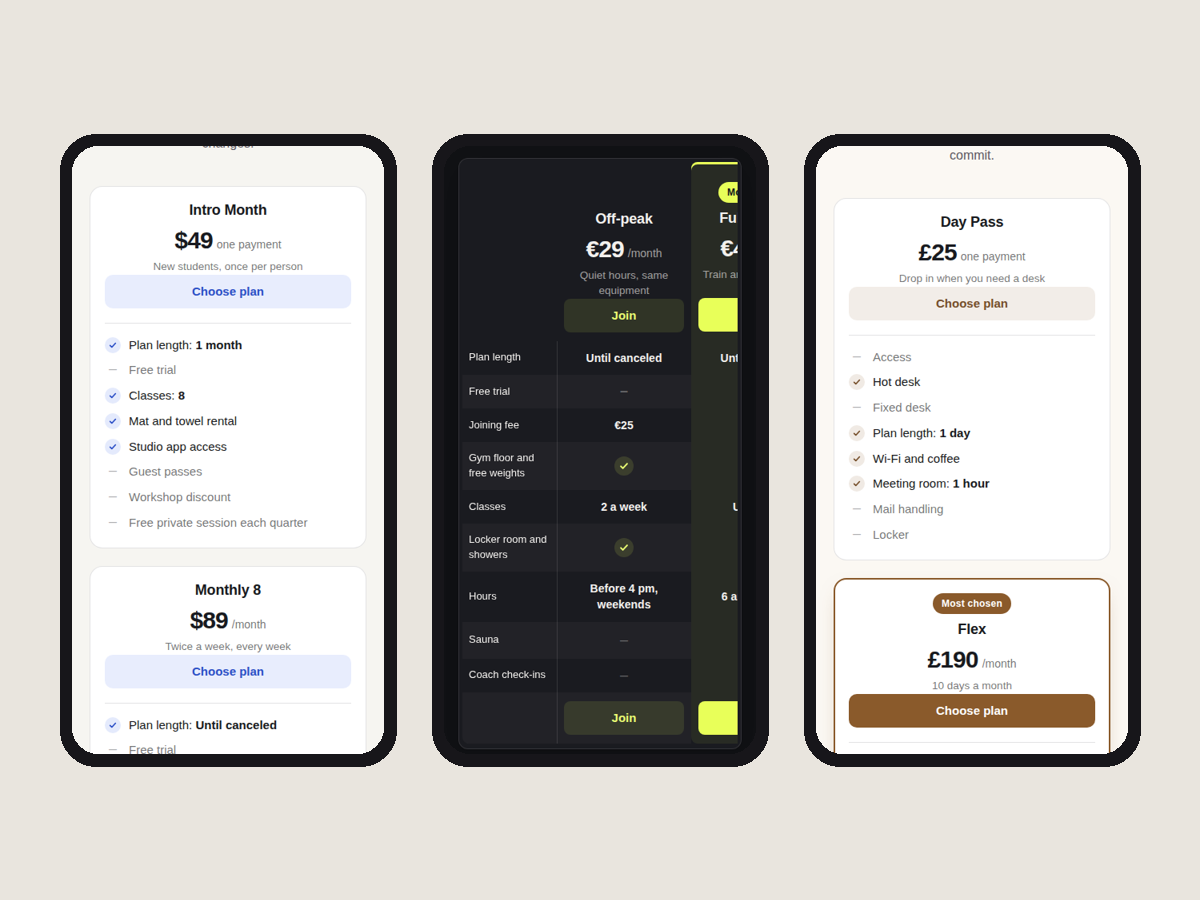
Plan Compare: Comparison Table uygulamasına genel bakış
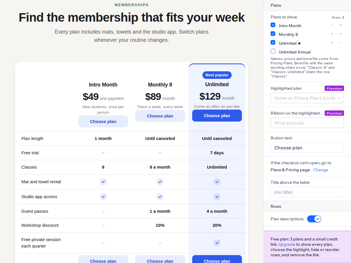
- Fills itself from your Pricing Plans
- Ticks, dashes and values for every benefit
- Highlighted plan with a ribbon and checkout
- One card per plan on phones
Değerlendirme ve yorumlar
Bu uygulama henüz değerlendirme almamış. İlk değerlendiren siz olun.Fiyatlandırma ve ücretli abonelikler
Basic Paketi
Ücretsiz
Up to 3 plans in your order
Rows for length, trial and fees
Your button text, colour and font
Small credit link under the table
Premium Paketi
$
3
20
/ay
Every plan you sell
Choose the highlight and ribbon text
Hide or reorder rows, table styles
Swipe grid on phones, no credit link
* Fiyat USD cinsindendir.